Design System
COMPANY
ROLE
EXPERTISE
YEAR
Documentation Zeroheight & Storybook
Background
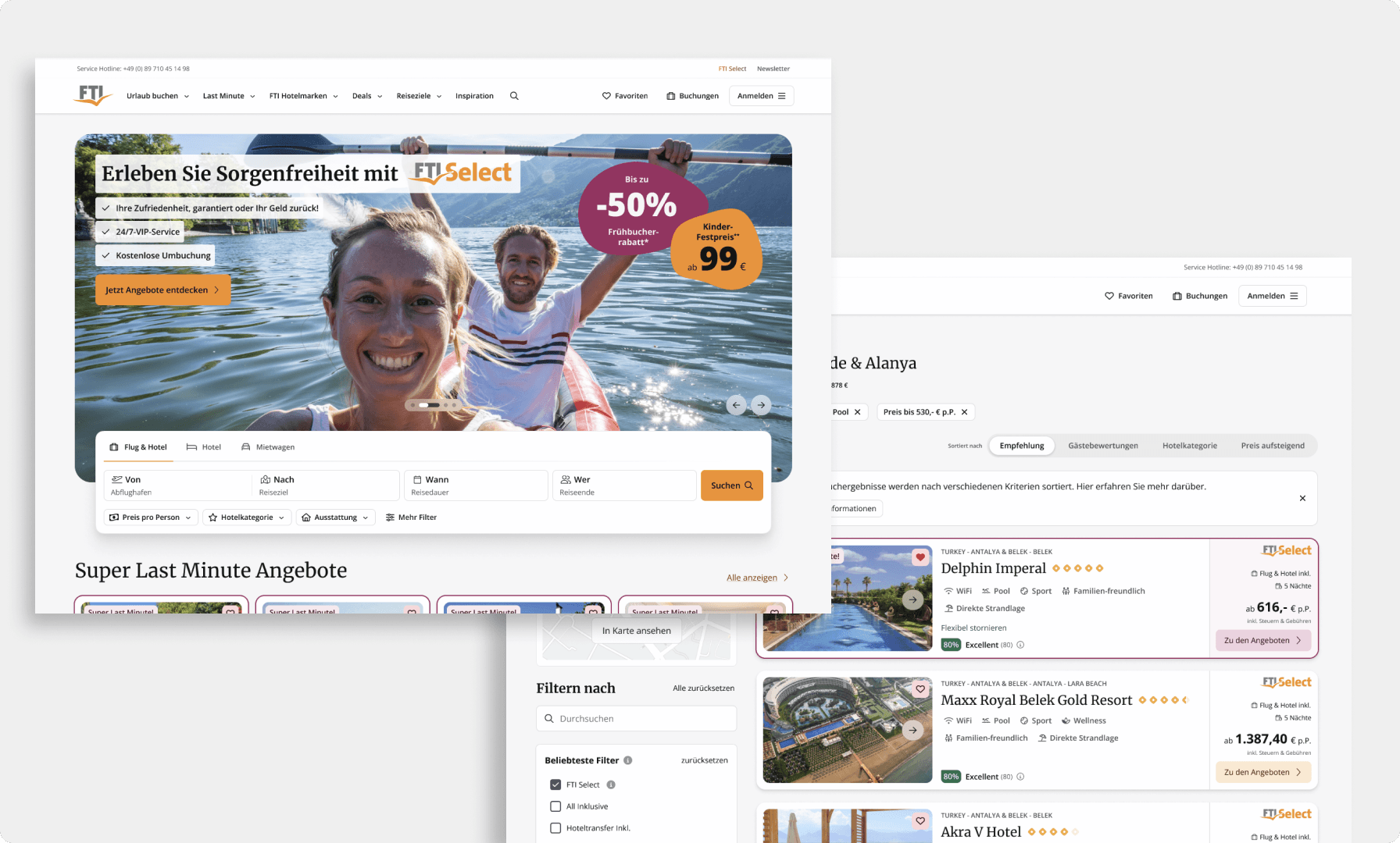
When I first joined FTI, our team worked with inconsistent Sketch files, lacking proper documentation. This often led to unnecessary meetings to resolve issues that could have been avoided with more structured documentation. The lack of consistency across our web and mobile user interfaces created a fragmented experience, making it difficult to maintain a cohesive design.
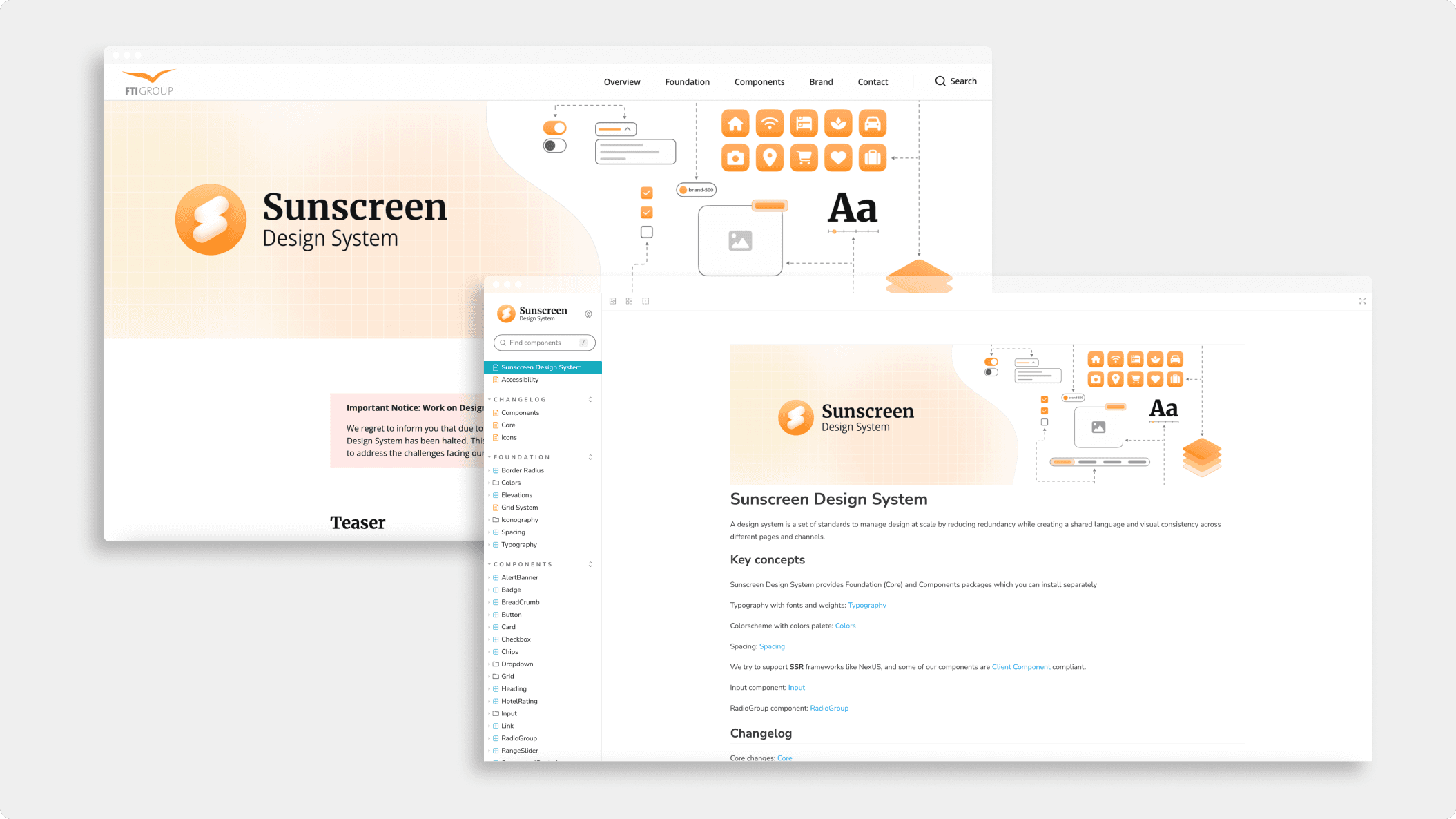
Since then we grew as a team and we established a scalable Design System with open source Documentation (zeroheight + storybook)
Goal
Establish a comprehensive design system that encapsulates a unified, intuitive, and delightful user experience across all digital touchpoints, ensuring consistency and efficiency.
Team
PO
3 Developers
3 Designers
Tools
Figma
Jira/Confluence
Zeplin
Zeroheight
Foundation
Discovery
The first step in our journey was to understand the current state of our design and development processes. We met with stakeholders from various departments, including design, development, marketing, and customer support. These sessions provided valuable insights into the challenges and pain points faced by each team.
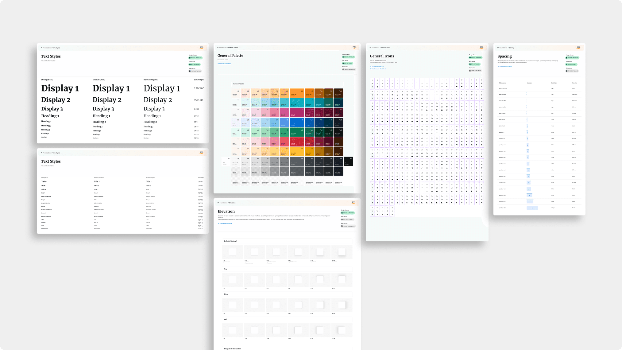
Foundation
Color Palette: We defined a color palette that matched our brand identity and guaranteed accessibility.
Typography: New typography, its scale and line height were defined to ensure readability and consistency.
Iconography: We introduced a new, consistent set of Icons, that matched our brand identity.
Spacing: We established the 4px spacing system in the design system.
Elevation: We defined a set of elevation effects (e.g. for cards) with various elevation levels & directions.
Grid System: A responsive grid system was created to support various screen sizes. We defined breakpoints based on our user's most commonly used devices.
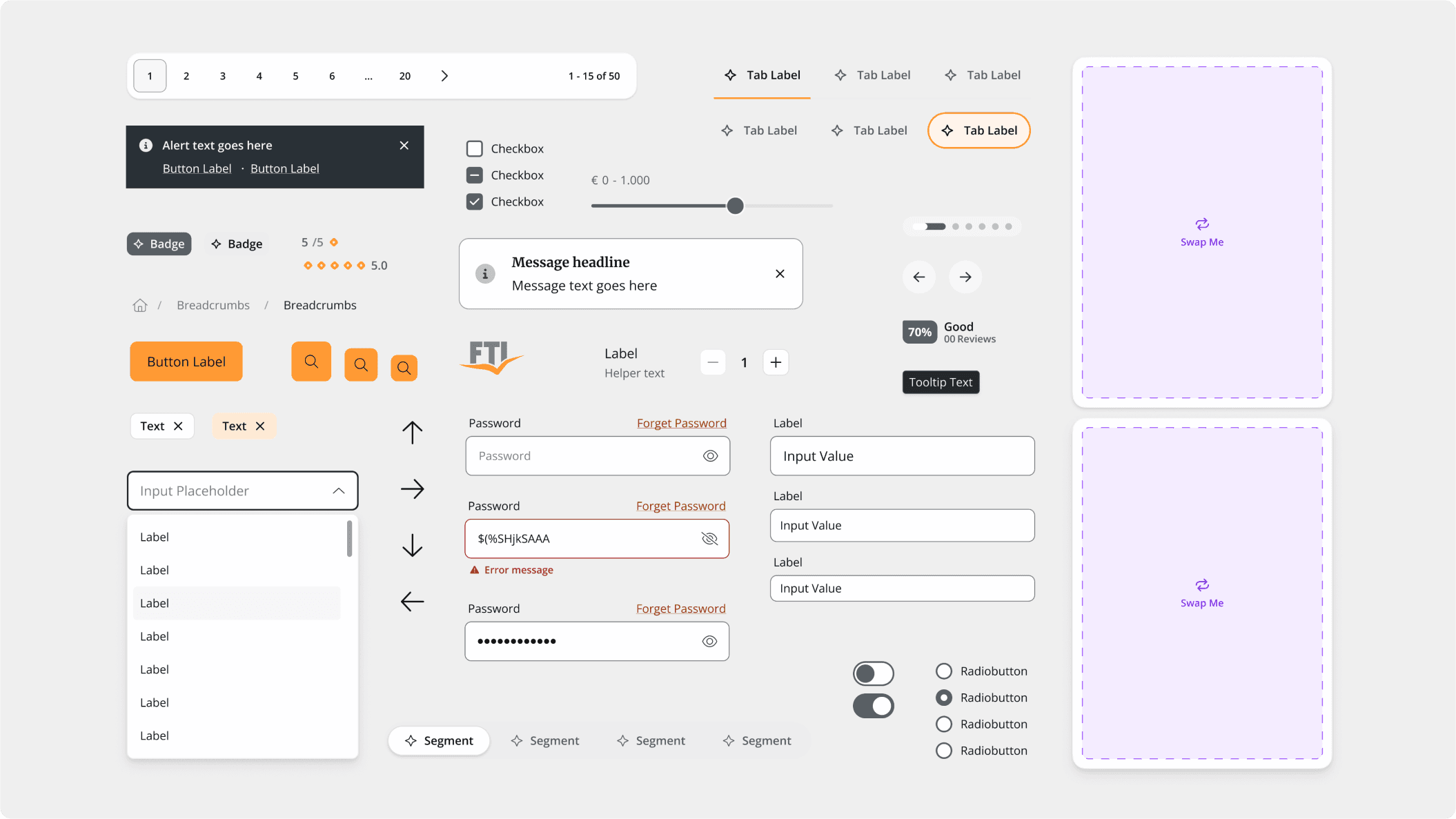
Components
Next, we designed a library of reusable components, such as buttons, checkboxes, tab navigation, switches and cards. Each component was build using Figma Variables (colors/spacing/border-radius) meticulously documented with usage guidelines, code snippets, and design specifications. We also developed design patterns for common interactions, such as the navigation header and quick search for the user's next destination search.
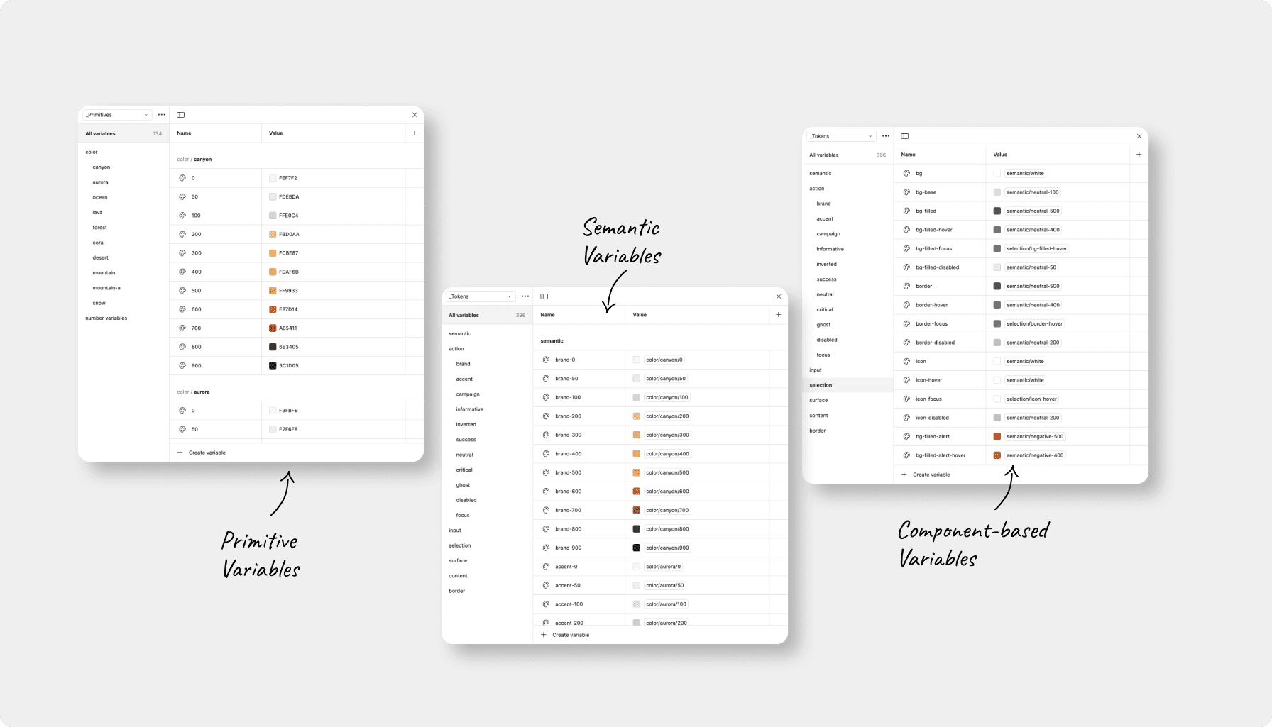
Variables
Documentation
To ensure the design system was accessible and easy to use, we created comprehensive documentation hosted on a dedicated platform. This included:
Design Tokens: Centralized variables for colors, typography, and spacing to ensure consistency.
Component Library: A collection of pre-designed components with implementation details.
Guidelines: Best practices and guidelines for using the design system effectively.
Collaboration
Creating the design system was a collaborative effort that involved various teams across the company. Regular meetings and feedback sessions were held to ensure alignment and address any concerns. Key collaborations included:
Design Team: Worked closely to create and refine design components and patterns.
Development Team: Ensured the components were implemented correctly and provided feedback on feasibility and performance.
Marketing Team: Aligned the design system with our brand strategy and marketing materials.
Flexible Components
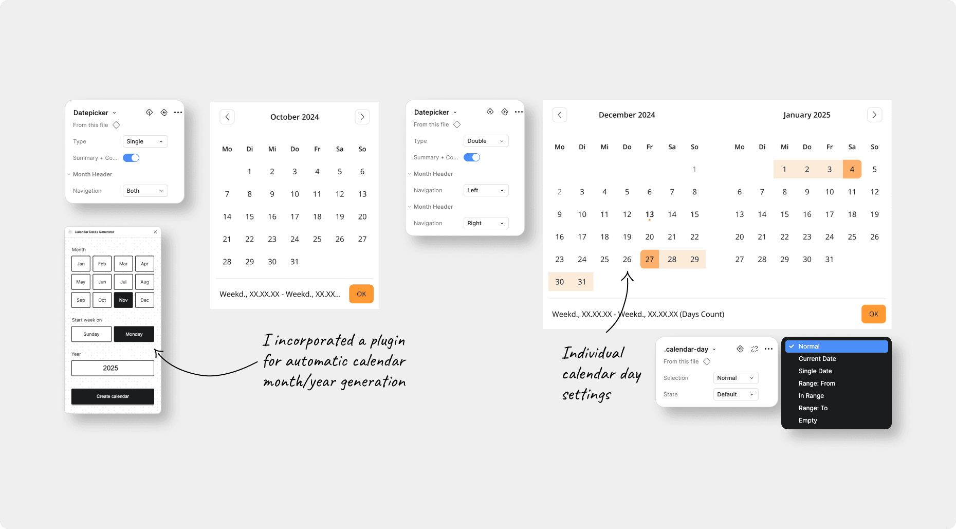
Component example: Datepicker